
In the world of high-end commerce, the product doesn't start at the "on" switch; it starts at the box. At HTS Web Solutions, we understand that for our global clients, packaging is the final barrier between a shopper and a sale. Whether you’re shipping a premium software hardware kit to Germany or a boutique cosmetic line to Singapore, your packaging is the physical embodiment of your brand’s promise.
As a tech-driven company, we bring a level of surgical precision to packaging design that traditional agencies often miss. We don’t just design a "pretty box"-we engineer a user experience. We think about the weight, the "click" of the lid, the texture of the label, and the clarity of the typography. To us, a product box is a high-stakes UI (User Interface) that lives in the real world. We make sure that when your customer holds your product, they feel exactly what you want them to: absolute quality.


In a retail environment, you have roughly three seconds to grab a consumer's attention. This is what marketers call "The First Moment of Truth." At HTS, we use "Burstiness"—striking color contrasts and bold "hero" typography—to ensure your product leaps off the shelf. We analyze your global competitors to make sure your box isn't just part of the crowd, but the leader of it.
Packaging is the only marketing medium that engages almost all the senses. The way a label feels under the thumb (tactile), the sound of the box opening (auditory), and the visual harmony of the colors—all these elements build a psychological profile of your brand. HTS Web Solutions specializes in creating these sensory touchpoints that build long-term brand loyalty.
A great design is useless if it doesn't fit the box. Our team works with precise die-lines (the flattened 2D pattern of the box). We account for folds, flaps, and glue areas to ensure that the artwork wraps perfectly around the corners. We bridge the gap between digital creativity and industrial reality, providing your printers with error-free files.
What is the most important part of your label? Is it the brand name? The key benefit? The regulatory icons? We use visual weight to guide the consumer's eye. On a crowded label, we ensure that the most persuasive information is the easiest to find, following a logical flow that leads directly to a purchase decision.
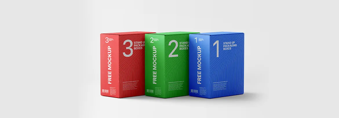
For our software clients moving into hardware (like IoT devices or VR headsets), we design "Tech-Luxe" packaging. This involves clean, minimalist boxes with precision-cut foam inserts that make the unboxing feel like an event.
These designs require high-density information and strict adherence to international regulations. We specialize in creating labels that are both compliant and beautiful, ensuring that warning symbols and ingredients are legible without ruining the brand aesthetic
Here, we focus on "vibe" and "aspiration." We use soft gradients, elegant serif fonts, and premium finishes to make your product feel like a treat for the consumer.
Global consumers are moving toward sustainability. We design for recycled materials and use "Minimalist Engineering" to reduce ink and material waste while maintaining a high-end, eco-conscious look.
While we specialize in custom shapes, we often work with international standards:
• Product Labels: Common sizes like 4"x3", 3"x2", or wraparound bottle labels (e.g., 8.25" x 1.75").
• Retail Boxes: Ranging from small tuck-end boxes (2"x2"x2") to large shipping corrugated boxes.
• Custom Die-Cuts: Any shape you can imagine, we can map out.
In printing, a millimeter can be the difference between perfection and disaster. We provide files with 3mm to 5mm bleeds and ensure all critical text stays within the "Safety Zone." We use CMYK and Pantone color matching to ensure that the blue on your screen is the exact blue that comes off the printing press.
• Embossing: Raising the logo to give it a 3D feel.
• Foil Stamping: Adding metallic gold or silver for a "High-End" look.
• Spot UV: Applying a glossy coat only to specific parts of the label (like the logo) to make them shine.
Reach us right away

© Copyright HTS Web Solutions 2026.